
Thursday, March 29, 2012
Mutiny on the Nautilus
I had time to jam out another quickie for concept art class - Mutiny on the Nautilus, Ned Land corners Nemo deep in the ship.

Wednesday, March 28, 2012
The Nautilus vs. Cthulhu
Not entirely satisfied with this, but in the interest of getting to other school assignments, it's going to have to stand for now.


Romulan Pale Ale
Romulan Pale Ale
Please Drink Responsibly
Romulan Brewing Company, Romulus

(Adobe Illustrator)
Please Drink Responsibly
Romulan Brewing Company, Romulus

(Adobe Illustrator)
Tuesday, March 27, 2012


Monday, March 26, 2012
9 thumbs my way
I didn't like any of my thumbs for my 20,000 Leagues "Wow" moment, so I redid them, but this time I used 3D. The grey blob will be Cthulhu once it turns into a painting, couldn't find a good 3D model of the dude.


Sunday, March 25, 2012

ECCC Sticker
I think I've decided that I'm not at a place where I could make a sketchbook for sale at a convention that I'd be happy with, so instead, I'm going to make a couple of different stickers, and sell them for cheap.
Would you pay $.50 for this guy?

Would you pay $.50 for this guy?

Saturday, March 24, 2012
2nd Character - Silhouettes
Beginning the design process for the 2nd character in my personal concept art class project. Character is a mutated human. She's the classic "human 2.0" archetype - tall, skinny, strong, fast and with a better sense of sight....she's also 14.


Thursday, March 22, 2012

Wednesday, March 21, 2012

Monday, March 19, 2012

Sunday, March 18, 2012
Pop Surrealism colour studies
Some quick colour studies to help me work out how I want my next piece to be.


Thursday, March 15, 2012
Style exploration
For concept art class, had to take my character and explore 5 different styles.

They are:
Cyborg009
Southpark
Tintin
How to Train Your Dragon
Tekkon Kinkreet

They are:
Cyborg009
Southpark
Tintin
How to Train Your Dragon
Tekkon Kinkreet
Tuesday, March 13, 2012
Romulan Pale Ale - Brief and Thumbs
For my "beer label" assignment in digital illustration.

Beer
Brand
|
Romulan
-
|
Beer
Type
|
Pale
Ale
- |
Beer
Colour
|
Light Blue |
Target
Audience
|
Loyal
soldiers of the Empire!
- |
Beer
Personality
|
Sneaky, subtle |
Illustrated
Goal
|
Create
a beer label that expresses the power,
of the Romulan Empire! The drinker should have no doubt in their minds that they are drinking the best (and only) pale ale to come out of Romulus. |

Monday, March 12, 2012

Sunday, March 11, 2012

Saturday, March 10, 2012

Porque?!?
Trying to work at being looser and more expressive, as I've said several times....this is me playing with hand-made text. I painted the BG, and the words on seperate pieces of paper, scanned them and combined. The text was run through a threshold adjustment in photoshop to make it pure B&W, then used as a mask for the red....the entire thing is a study/step for my pop surrealism painting.


Wednesday, March 7, 2012

Tuesday, March 6, 2012
a process of character painting - step 1
I tweeted about it on Sunday, but I've been trying something different....I grabbed some 18x24" cartridge paper, a paint brush and some liquid acrylic Paine's Grey. From that I did 20 very, VERY loose gesture paintings, trying to get my arm into the drawing as much as my wrist. I picked a couple of favorites, took shitty photos of them with my phone, imported them into photoshop and I'm starting to clean them up a bit.
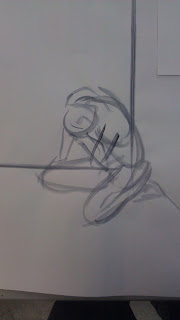
 Ultimately, I hope to use this for my next pop surrealism painting, where I'm going to be looking at Sam Kieth's work and trying for more looseness and expressiveness in my work.


Darker Than You Think - tweaks
Based on feedback, adjusted the girl's hair a bit, and decided to push the airport a bit further back.


Monday, March 5, 2012
Darker Than You Think - Done?
Might do a bit of distressing to make it look old, but I think this is basically the end of the regular painting. When I do one of these, I like to make a copy and run it through the "Threshold" adjustment in Photoshop to turn it into pure black and white. If it's readable that way, chances are good the final illustration will also be. I'm am reasonably happy with this one :)


Oh, the text won't stay in the final deliverable, but it just doesn't look like a pulp cover without it, so I threw it on as a spaceholder.
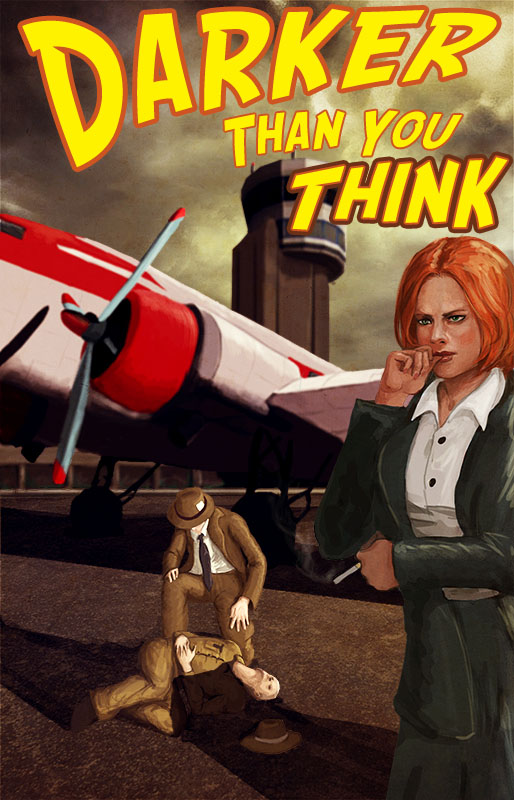

Oh, the text won't stay in the final deliverable, but it just doesn't look like a pulp cover without it, so I threw it on as a spaceholder.
Sunday, March 4, 2012

Big gesture time
Trying to do something different - drawing with acrylic paint on cartridge paper and an easel. Getting my arm involved as well as my wrist.


Friday, March 2, 2012
Darker Than You Think - 2nd Update
Some more work and some VERY helpful advice from my friend Mike MacRae (one of the 9 Society of Illustrator winners from ECUAD!)

